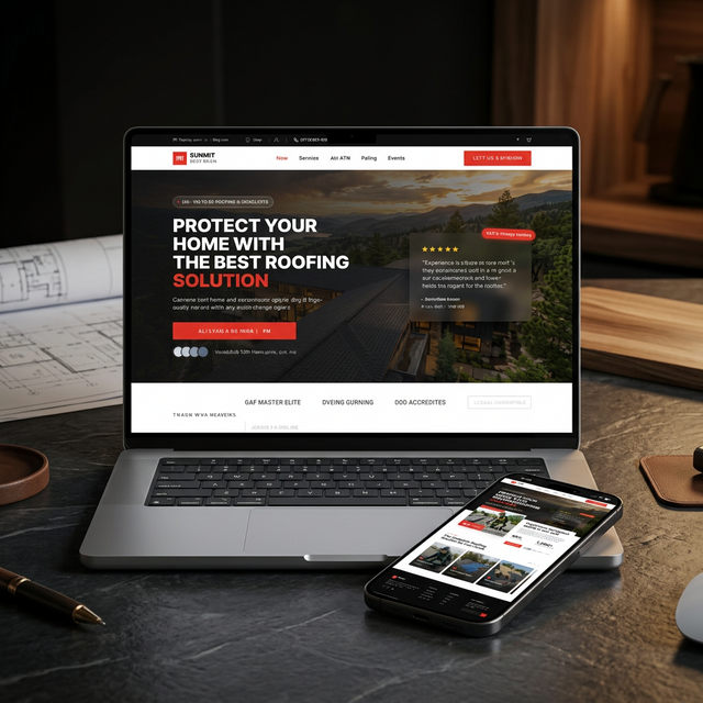
Summit Roofing Co. — High-Converting Landing Page
A dedicated landing page designed to replace a generic homepage as the paid ad destination. One page, one goal: turn paid clicks into booked roof inspections.
$15–40
Cost per click on Google Ads
< 8s
Average time on old homepage
2,400+
Charlotte homeowners served
60 min
Response time guarantee
The Brief
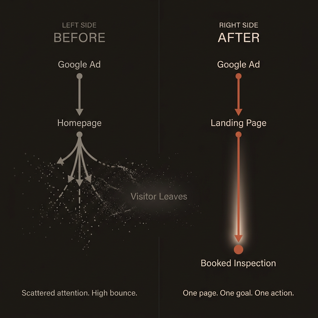
A roofing contractor in Charlotte spends $3,000–5,000 per month on Google Ads and Local Services Ads. The ads generate clicks. But those clicks land on the company's homepage — a generic 5-page site with a stock photo slider, an "About Us" nobody reads, and a contact form buried on a separate page.
The math doesn't work. Paid traffic that costs $15–40 per click is being sent to a page that asks the visitor to navigate, explore, and eventually find a way to get in touch. Most of them leave in under 8 seconds.
I designed a dedicated landing page to replace the homepage as the ad destination. One page. One goal. Every element exists to move a homeowner from "I clicked an ad" to "I just booked a free roof inspection."
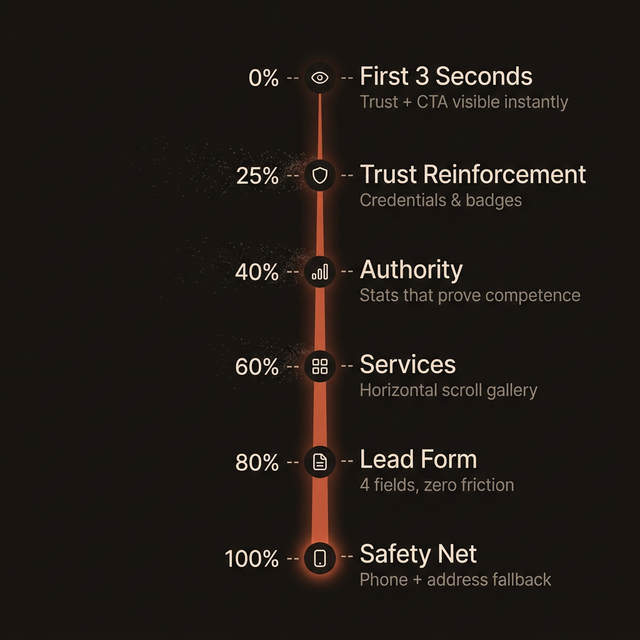
The Conversion Funnel
A high-converting landing page isn't a collection of sections thrown together. It's a funnel — a deliberate sequence that matches the visitor's mental state at each scroll depth and moves them closer to action.
Scroll Depth 0% — The First 3 Seconds
The visitor just clicked an ad for "roof inspection Charlotte." They're scanning, not reading. The hero section has 3 seconds to answer three questions: "Am I in the right place?" — the headline confirms it immediately. "Can I trust these people?" — a floating testimonial card with a named, located customer sits in the hero viewport, plus avatar thumbnails and "Trusted By 2,400+ Charlotte Homeowners." "What do I do next?" — a single, high-contrast CTA button: "Schedule Free Inspection." No competing links, no navigation pulling attention away.
Scroll Depth 25% — Trust Reinforcement
The visitor didn't convert immediately. That's normal. They scroll and hit the trust logo strip: GAF Master Elite, Owens Corning, BBB Accredited, Google Guaranteed, Licensed & Insured. Each badge answers a specific objection. The visitor doesn't consciously process each one — they register the volume of credentials and feel safer. That's enough to keep them scrolling.
Scroll Depth 40% — Establish Authority
The about section doesn't tell the company's founding story. Nobody cares. Instead, it presents two numbers that matter: 98% Client Satisfaction and 1,200+ Roofs Replaced in Charlotte. Large type. No paragraphs of explanation. The numbers speak for themselves.
Scroll Depth 60% — Show What You Do
A horizontal-scroll gallery of service cards: Roof Inspection, Storm Damage Repair, Full Replacement, Gutter Installation. Each card is a full-bleed background image with a numbered label. The cards don't link to separate service pages — they link to the contact form below. Every path leads to the same destination.
Scroll Depth 80% — The Form
The lead capture form is deliberately simple. Four fields: Full Name, Phone Number, Service Needed, and Best Time to Call. No email field. No address field. No "how did you hear about us." Every additional field reduces completion rate. Below the submit button: "Free inspection. No obligation. We respond within 60 minutes." Three objections killed in one line.
Design Decisions
Every design choice on this page exists to serve the conversion goal. Nothing is decorative.
No Navigation Menu
This is the single most important design decision. The landing page has no top navigation. No links to "About Us," "Services," or "Gallery." Every link that isn't the CTA is an exit. A visitor who clicks "About Us" enters a browsing mindset. A visitor with no links to click either fills out the form or leaves. The entire page is the sales pitch.
Mobile-First Form Placement
On desktop, the form sits in the right column of the contact section. On mobile, the form is the dominant element — full-width, large touch targets, thumb-friendly submit button. 70%+ of paid ad traffic lands on mobile. The form experience on a 375px screen is more important than how it looks on a 1440px monitor.
Dark Palette With Texture
The page uses charcoal, navy, and warm gold rather than the typical red-white-blue of the roofing industry. The gold accent color is reserved exclusively for CTAs and trust elements. When the eye is drawn to gold, it's always drawn to something that builds trust or asks for action.
Urgency Without Manipulation
The page creates urgency through speed promises and scarcity signals — not fake countdown timers or "only 3 spots left" lies. These tactics convert in the short term and destroy trust in the long term.
Technical Implementation
No Navigation
Every link that isn't the CTA is an exit. Removing navigation keeps visitors focused on a single action: fill out the form.
Mobile-First Design
70%+ of paid ad traffic lands on mobile. Full-width forms, large touch targets, and thumb-friendly submit buttons prioritize the majority use case.
4-Field Form
Name, phone, service needed, best time to call. No email, no address. Every additional field reduces completion rate — collect the rest on the follow-up call.
Trust Architecture
Manufacturer certifications, named customer testimonials, and specific stats (2,400+ homeowners, 98% satisfaction) positioned at key scroll depths.
The Impact
Before
- Paid clicks landing on a generic 5-page homepage
- Contact form buried on a separate page
- Competing navigation links pulling attention away
- No trust signals above the fold
- Visitors leaving in under 8 seconds
After
- Dedicated landing page as the sole ad destination
- Form integrated directly into the page flow
- Zero navigation — one page, one action
- Trust signals in every scroll depth zone
- Deliberate funnel matching visitor psychology
What I’d Add Next
- 160-second auto-response — Automated text within one minute of form submission with appointment confirmation and next steps
- 2Smart routing — The "Service Needed" dropdown value triggers different assignment rules. Storm damage leads go to the insurance claims team.
- 3Speed-to-lead tracking — Every form submission timestamps when the lead came in and when the first human call was made. Goal: under 15 minutes.
- 4No-show recovery — If a scheduled inspection is missed, automated text within 30 minutes with a one-tap reschedule link
- 5Review generation — 48 hours after a completed job, automated text requesting a Google review
Want a system like this for your business?
Every automation project starts with a conversation about where your leads are falling through the cracks. Let\u2019s figure out what to build.