Prestige Realty Group — Conversion-Focused Website Redesign
A ground-up website redesign that replaced a generic IDX template with a trust-first, conversion-focused site built around the two audiences every real estate agent needs to serve: buyers and sellers.
6 → 30+
Pages reduced, focus increased
< 1.2s
First contentful paint
< 400KB
Total page weight
75%+
Mobile traffic served
The Brief
Most real estate agent websites are IDX listing portals wrapped in a template. They have a property search bar nobody uses (buyers already have Zillow), 47 pages of neighborhood guides nobody reads, and a headshot from 2019. The agent's phone number is somewhere in the footer.
The result is a site that feels like every other agent's site. It ranks poorly because the IDX content is duplicated across thousands of identical templates. It converts poorly because nothing on the page answers the one question a potential client is actually asking: "Why should I work with this person instead of the 200 other agents in my market?"
I redesigned this website around a fundamentally different strategy: stop competing with Zillow on listings and start competing on trust, expertise, and the human relationship.
Discovery: Understanding the Real Estate Buyer
Before designing anything, I mapped the two audiences this site needs to serve.
Audience 1 — Home Buyers
They're anxious, overwhelmed, and comparing agents. Most are first-time buyers who don't understand the process. They've been browsing Zillow for months and now realize they need a professional. They're looking for someone who will guide them, not just unlock doors. Their biggest fear: overpaying, losing bids, or getting stuck with a bad investment.
Audience 2 — Home Sellers
They want to know one thing: how much is my home worth and how fast can you sell it? They're comparing agents on two criteria — track record (homes sold, average days on market, sale-to-list ratio) and personality (do I trust this person to handle my biggest asset?). Their biggest fear: their home sitting on the market for months.
What Both Audiences Share
They're making the biggest financial decision of their lives. Trust is everything. They want proof of competence, not promises. And they're making their initial decision in under 30 seconds on their phone.
Site Architecture
The old site had 30+ pages. Most were auto-generated IDX neighborhood pages with thin, duplicate content. I rebuilt it as 6 focused pages, each with a single clear job.
- No IDX listing search — buyers use Zillow, don't compete, complement
- No 20-page neighborhood guide — a single "Areas I Serve" section with a map
- No blog — unless the agent will publish weekly, which they won't
| Page | Job |
|---|---|
| Home | Establish credibility in 3 seconds, split path for buyers vs sellers |
| Buyers | Demonstrate the buying process, reduce anxiety, drive to consultation |
| Sellers | Show track record, offer free home valuation, drive to listing appointment |
| About | Build the personal connection that wins the listing appointment |
| Reviews | Let past clients do the convincing |
| Contact | Free consultation booking with zero friction |
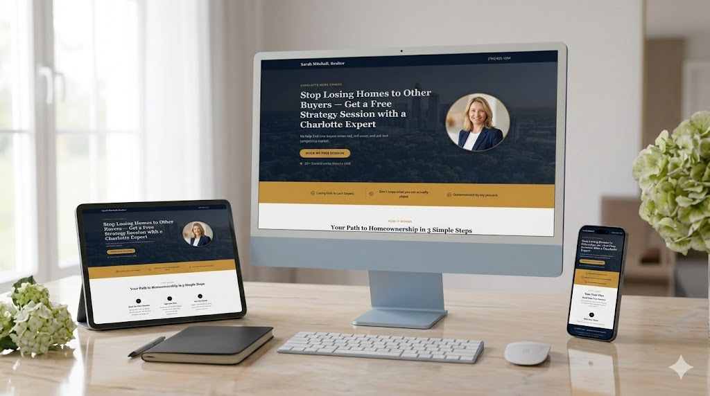
Home Page: Two Audiences, One Page
The home page solves the hardest problem in real estate web design: buyers and sellers want different things, but they land on the same page.
Hero Section
A confident headline that speaks to both audiences without being generic. "Charlotte's Top-Rated Agent for Buyers and Sellers" paired with a real photo of the agent (not a stock skyline). Two CTAs side by side: "I'm Buying" and "I'm Selling." This immediately splits the audience into the right path.
Trust Bar Below the Fold
Transactions closed (specific number, not "hundreds"). Average days on market (proves speed for sellers). Google review score with review count. Years of experience. These four numbers do more selling in 2 seconds than 2,000 words of copy.
Selected Testimonials
Two featured reviews — one from a buyer, one from a seller. Each tagged with the transaction type, neighborhood, and year. This reinforces the split-audience strategy: both audiences see social proof relevant to them.

Buyers Page: Reduce Anxiety, Build Confidence
First-time buyers are overwhelmed. The page structure mirrors their emotional journey — validate the feeling, simplify the process, show what they get, then prove it with stories.
- Section 1 — Validate the feeling: Name the pain before offering the solution. "You've probably lost a bid or two already. That's normal — and it's exactly why working with the right agent changes everything."
- Section 2 — The process, simplified: A 5-step visual timeline (Pre-Approved → Define Search → Tour & Evaluate → Make an Offer → Close & Move In). Makes the chaotic feel structured and manageable.
- Section 3 — What you get: Off-market listings, offer strategy coaching, negotiation on your behalf, vendor network for inspections, lending, insurance, moving.
- Section 4 — Buyer success stories: 3 testimonial cards mentioning neighborhood, timeline, and outcome. "We closed in 21 days on our first offer in South End."
Sellers Page: Track Record First
Sellers choose agents based on results. The page leads with proof — not promises.
The Numbers
Homes sold in the last 12 months. Average sale-to-list price ratio (e.g., "My listings sell for 101.3% of asking"). Average days on market vs market average. These numbers are displayed large, with context — "Average days on market: 14" means nothing without "Charlotte average: 32 days." The comparison makes the number meaningful.
Free Home Valuation Offer
"Curious what your home is worth? Get a personalized market analysis — not a Zestimate." This is the primary lead magnet for sellers. Short form: address, name, phone, email, timeline. The word "personalized" differentiates from automated valuations every other agent offers.
Marketing Plan
Professional photography and video walkthrough. Staged listing on MLS, Zillow, Realtor.com, and social media. Targeted Facebook/Instagram ads to qualified buyers. Open house strategy. Weekly seller updates with showing data and feedback. The prospect should finish reading this and think "I want all of that."
About & Reviews: The Human Behind the Transaction
Real estate is a relationship business. The about page exists to make the agent feel like someone you'd actually want to spend weekends with touring houses.
- First-person story: how they got into real estate, why Charlotte, what they love about helping people
- Professional headshot AND a casual photo — at a community event or with past clients at a closing
- Specific credentials: license number, brokerage affiliation, certifications
- Community connection: neighborhoods they live in, local involvement
- Reviews page with filter by type (Buyers / Sellers), star ratings, neighborhood and year tags
- Featured reviews get premium placement; video testimonials embedded when available
Contact Page: One Clear Path
The contact page doesn't force both audiences through the same form. Buyers want a conversation. Sellers want a valuation. Giving each audience their own path increases completion rates because the form matches their intent.
- Buyers: "Book a Free Buyer Strategy Session" — calendar embed with 30-minute slots
- Sellers: "Request Your Free Home Valuation" — short form (address, name, phone, timeline)
- Everyone: Phone number, email, office address, hours, and a map
Technical Decisions
Every technical choice was made to support the conversion strategy, not to impress other developers.
No IDX Integration
The most controversial decision and the most important one. IDX listing feeds create thousands of pages of duplicate content that hurt SEO, add complexity, and serve a function that Zillow already handles better. The website's job is to convert, not to be a listing portal.
Schema Markup
RealEstateAgent, LocalBusiness, Review, FAQPage. This feeds Google's knowledge panel and improves visibility for "[agent name] realtor Charlotte" searches.
Performance
Under 400KB total page weight. No JavaScript framework — static HTML with minimal JS for the map and form validation. First contentful paint under 1.2 seconds. Mobile-first with sticky phone button, thumb-zone CTAs, and tap-to-call on every page.
Technical Implementation
Static HTML + Minimal JS
Fast and light. Under 400KB total page weight with first contentful paint under 1.2 seconds. No heavy framework — performance is the priority.
Schema Markup
RealEstateAgent, LocalBusiness, Review, and FAQPage structured data to feed Google's knowledge panel and improve local search visibility.
Mobile-First CSS
75%+ of real estate searches start on mobile. Sticky phone button, thumb-zone CTAs, and tap-to-call on every page.
Interactive Map
Replaced 20 auto-generated neighborhood pages with one interactive section showing neighborhood pins with recent transaction data.
The Impact
Before
- 30+ auto-generated IDX pages with duplicate content
- Generic template indistinguishable from competitors
- No conversion strategy — just a digital brochure
- Slow page load from IDX widget overhead
- Single generic contact form for all audiences
After
- 6 focused pages, each with a clear conversion job
- Trust-first design built around proof and credibility
- Split-audience paths for buyers and sellers
- Under 400KB page weight, sub-1.2s first paint
- Intent-matched forms: consultation for buyers, valuation for sellers
What I’d Add Next
- 1Instant response automation — within 60 seconds of form submission, personalized text to the prospect with next steps and a direct calendar link
- 2Buyer drip sequence — weekly email with new listings matching their criteria, market updates, and buying tips to stay top-of-mind during the 3–6 month search process
- 3Seller follow-up — after the free valuation, automated sequence: Day 3 (market comparison data), Day 7 (success story from a similar home), Day 14 (limited-time listing incentive)
- 4Review generation — 48 hours after closing, automated text asking for a Google review. This compounds the reviews page over time.
- 5Past client nurture — annual home anniversary email, quarterly market updates, and a referral prompt to drive repeat business
Want a system like this for your business?
Every automation project starts with a conversation about where your leads are falling through the cracks. Let\u2019s figure out what to build.